Poetry in Commotion
“Subliminal” seems to be the rule when it comes to displaying a building’s address. Carved into limestone or etched on glass, it’s often rendered so unobtrusive, that we’re left wandering the sidewalk unable to find our destination. Walking past this building (just north of Madison Park), I had to stop and marvel at the audacity with which the designer upended such unspoken rules. “Type” becomes an integral—if not the defining—design element. And beautifully so.
Another example of a “thing done well,” when its ilk is usually not, it prompted me to share a 2018 post of mine (from another platform) below.


This newly completed luxury high-rise is in serious promotion mode, which makes me think these wonderfully disruptive graphics are temporary.
(Original Post, November 14, 2018)
A Two-Block Testimonial to Things “Done Well.”
While Le Corbusier called New York City a “beautiful catastrophe”, it can be hard to find much beauty in its unsightly (if not unsound) scaffolding and forgettable new high-rises. But for every subway service disruption sign suffering from graphic malaise, there IS a terra cotta treasure just waiting to be “Instagrammed.” You just have to keep your eyes open. As a simple walk from 54th and Seventh to 53rd and Eighth proved.
54th Street & Seventh Avenue
A 1912 Masterpiece

One of 45 buildings designed by George and Edward Blum between 1910 and 1917, The Adlon (200 West 54th Street) was named after Berlin’s luxurious Hotel Adlon (made notorious 90 years later when Michael Jackson dangled his 9-month-old son from a fifth-floor balcony). With its specially-commissioned terra cotta tiles, creative brickwork and two-story pressed copper fluted pilasters rich in Arts and Crafts detailing, the 12-story Adlon is no average residence. And the Blum brothers no average architects. At the time, most speculative developers depended on stock masonry designs to keep costs down. (And it wasn’t uncommon to file the same set of "dummy plans" over and over at the Department of Buildings.)

Cheap double-hung windows have replaced many of the Blums’ original narrow, side casement windows—innovations at the time that allowed for better ventilation.

A modern, 21-story fire-proof apartment house of the highest class, situated on the southwest corner. Fifty-fourth Street and Seventh Avenue. Apartments contain every modern equipment for housekeeping. Highest grade solid porcelain fixtures used throughout. Telephones in kitchen and also in apartment. All windows open to the outside, as there are no interior courts insuring good light and ventilation for every room.
(Excerpt from “The World’s New York Apartment House Album”, above)
Defying convention, the brothers emphasized masonry’s “texture” over conventional ornament. And their shared decorative vision—honed at the Ecole des Beaux-Arts in Paris—can be seen from Park to West End Avenues. But for how long? The Adlon lacks landmark status—making it vulnerable to the whims of management or co-op boards (who’ve already stripped 251 W. 89th Street of its intricate metalwork and “scalped” the delicate 454 Riverside Drive). The building lost its iron balconies when it went co-op. And rusting lintels have left openings along its facade. Thankfully, there are reports of shareholder-occupants not simply working to protect The Adlon, but hoping to restore its original projecting canopies. (Which should restore a bit of hope in all of us.)
“The Blums’ work encourages the optimist to believe that beauty may be found in the least expected places.”

The Blum’s elaborate masonry and metalwork has been likened to the cover of a medieval manuscript. (Shown: The Arlon’s entrance)
53rd Street & Broadway
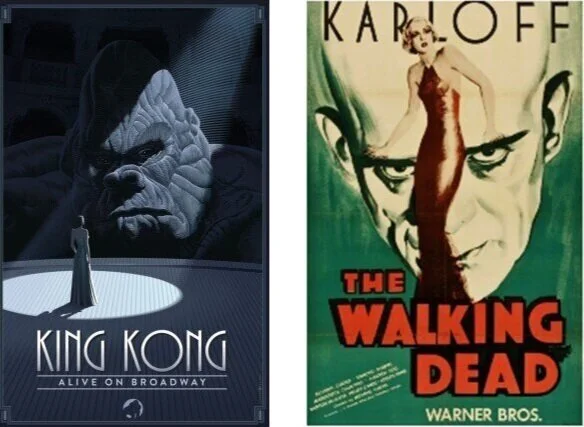
A Trio of Theater Posters Tell King Kong’s Story Better Than the Show Itself
The story of King Kong has held our imaginations for 90 years. Epic and intimate, thrilling and heartbreaking—the simple tale of a giant ape ruined by his love for a down-and-out actress seems nearly impossible to screw up. Then “King Kong: Alive on Broadway” comes along—ruined by a retelling that’s laughable. Nonsensical. A train-wreck. I suggest fans avoid the $150 ticket price and view the show’s breathtaking poster series at the corner of 53rd Street & Broadway. They capture the story in ways the show only wished it could.

Hoping for three unique perspectives, producers chose artists from three different countries; Left to right: Olly Moss (UK), Laurent Durieux, (Belgium), and Francesco Francavilla (US).
Believing the show was too big for ONE marketing image, ad agency, SpotCo commissioned art from three celebrated graphic novel/comic book illustrators: Laurent Durieux, Francesco Francavilla, and Olly Moss.
While the three often employ the kind of classic-movie-poster style used for the original film, it was their fame among the “fanboy community” (not one to typically go to the theater) that closed the deal. And on May 5, 2018 (Comic Book Day!), the pursuit of comic book/movie/video game lovers continued when collectible editions of the posters were handed out at local comic book stores.
It’s no surprise to Olly Moss fans that his Kong image was chosen for the theater’s marquee (shown at bottom of post). What’s surely surprising is that he also created the poster for Broadway’s “Frozen” nine blocks south.

One of SpotCo’s in-house concepts (left) and a preliminary sketch from British-based Olly Moss (right).
“They said, ‘Try not to make Kong too scary,’ which made it surprising to me that that was the one they’d ended up picking.”
Last to join the project, Francesco Francavilla was asked to emphasize New York (right)—an important element of the Kong story, and one missing from the other two designs. Fans of his illustrations for “Batman: Black Mirror,” will recognize his brooding profiles and deep shadows anywhere. Following a 2017 commission to create a collectable poster for the film, “Kong: Skull Island,“ “I can safely say I am a lifetime fan of KING KONG,” says the artist.

Two of Francesco Francavilla’s preliminary sketches and his final poster (right).
Francis Ford Coppola has said that Laurent Durieux's work takes poster art to a higher level, ”Expressing ideas and themes of the movies he has chosen in new terms." Having already reimagined the poster for the 1933 “King Kong,” his Broadway version (at left below) fittingly features the stage—while capturing the intimacy between Kong and Ann that gives their story its heart.
Why do the three posters resonate the way they do? Certainly graphic novels and the new golden age of comic books have made these illustrators (and others like them) a part of our visual vocabulary. To others like me, they’re a beautiful homage to the expressionistic horror movie posters of the 1930’s. Or simply reminiscent of how we remember them looking. Regardless, they transported me away from the angry bustle of a Broadway corner.
Beauty may have killed the beast. But it is keeping the art of the theater poster very much alive.
The international advertising magazine, Lürzer’s Archive, named Durieux (left) one of the world’s 200 Best Illustrators. Note the similarity of scale and fonts between the 1931 poster at right and Durieux’s.
53rd Street (Between Broadway & 8th Avenue)
A 62-Story Sculpture

Its developer has described the ARO as “contextual sculpture.”
One need only consider King Kong’s current home, The Broadway Theatre (bottom, right)—originally built in the Italian Renaissance style, and now resurfaced in forgettable polished granite—to be reminded of the disregard our city so often shows historic and/or thoughtful architecture.
By contrast, the ARO seems like a work of art. And it is. With its white steel lattice outer shell projecting from its curved glass facade, the 62-story residential tower has already amassed numerous design awards, including the American Architecture Prize (2017), the Architecture Podium International Award (2017), and the SARA National Award (2015).
Seeing it for the first time, I felt compelled to take a picture (a rare occurrence) and share its “Jetsons”-like vibe with my nieces and nephews. And while its “net” of steel gives ARO its futuristic look, it also acts as a solar device and protection from the sun.
“The undulation captures the sunlight and creates depth, a quality that one admires in traditional buildings but is difficult to achieve in modern structures.”

Nancy J. Ruddy of CetraRuddy
As a long-time Westsider, I remember when Roseland Ballroom called the site home. Hearing that the developer saved letters from the venue’s 53rd Street signage to incorporate into the lobby’s sculpture made me realize what “thoughtful design” really means.
With its curved balconies and sensuous interior spaces (designed by Nancy J. Ruddy) ARO adds a welcome fluidity and sense of motion to the surrounding bumper-to-bumper blocks.
Will it have people dancing again? You never know.

The uninspired façade slapped across The Broadway Theater is symbolic of our city’s disregard for its historic architecture.